The Magic Roundabout™ schematic - a tool for visualising trends
Predicting the future via trend visualisation using The Magic Roundabout™ schematic
Intro
I remember my first economics lesson at university, where we were given a selection of economic theories and models and asked to judge which ones were the most useful. Some were just plain wrong, but after eliminating those, there were two left—one that fit the data beautifully and another that was vague. Naturally, I chose the elegant one, and naturally, I was wrong because while it explained what happened in the past, it had no predictive value. The vague and messy theory that provided at least a partial way of predicting an outcome given a single variable, was the correct answer.
Creating these kinds of models is difficult at the best of times, but it becomes even more so when many of the trends that used to be stable, or at least linear, now seem to be in a chaotic state of flux.
Suppose you want to lead people by highlighting the dangers of maintaining the status quo for too long or paint a bright future that motivates them to take new action. In that case, you must be able to give people insight into trends and patterns they may not be able to see while they are fighting in the trenches. You need to be able to shine a light on your blind spots and cognitive biases and find an easy-to-understand tool that helps to both understand the world around you and to help you share those insights with others.
Some Existing Tools
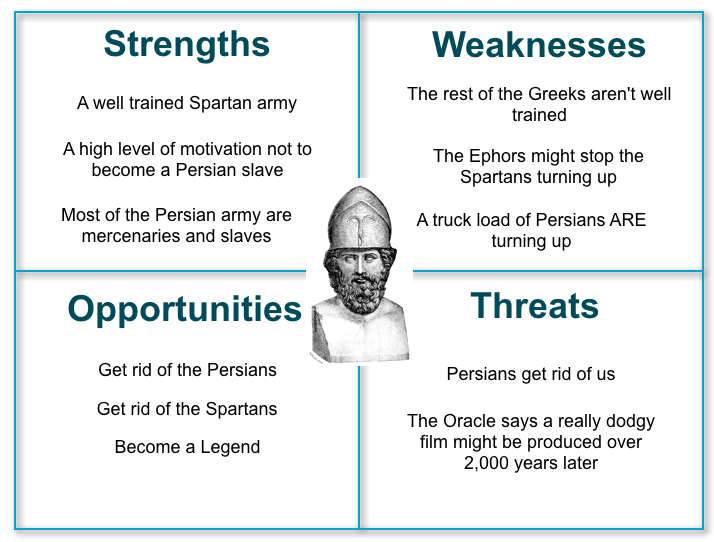
These kinds of tools have been around for a while. Some, like the SWOT diagram, are known and have been used by almost everyone. They’re a good tool, but often, they don’t give us the best idea about exactly where and when we should put in our efforts. One of my favourite critiques of the SWOT analysis comes from Simon Wardley in his blog Bits or Pieces, where he makes a case for maps vs diagrams.
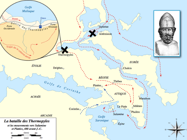
We also have access to well-known diagrams like the Gartner hype cycle or the technology diffusion curve that assume new things are adopted in an almost universal pattern, with adoption rates being the only variable.
These are all useful, but from my experience, they reinforce our prejudices and cognitive biases, leaving us open to disruption that could have been predicted and exploited if we had taken a broader view.
Finding new perspectives
One example was what some think of my employer’s “just-in-time” recognition of the importance of sustainability at a corporate level. My team were tasked with discovering how we almost missed it and how to identify and take advantage of upcoming changes to customer perceptions and buying criteria.
Our analysis found a range of reasons why, as an organisation, we developed a blind spot to the importance of ESG for IT purchase decisions instead of primarily investor relations and how other vendors like Pure managed to grab a head start. The simplified explanation is that my employer released its inaugural ESG report when energy prices worldwide were at the end of a decade-long decline. In contrast, Pure released theirs when power prices in Europe and Japan had increased by a factor of eight in six months.
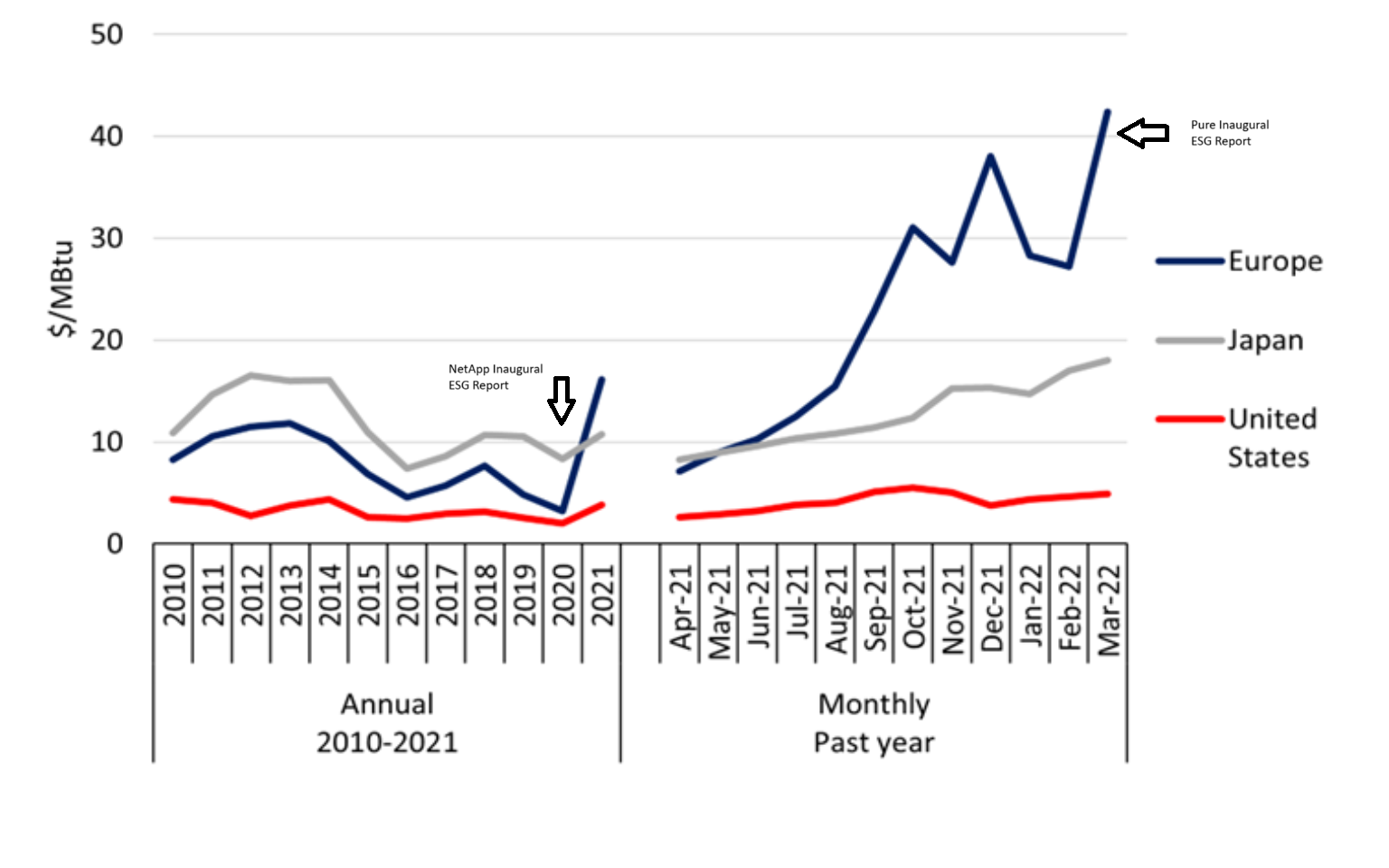
We were probably insensitive to the changes in power prices outside of the US because research from McKinsey in 2020 said that improving operational efficiency and reducing costs was one of the least impactful aspects of ESG and had significantly decreased in importance over the prior decade.
Our competitor was more lucky than good in their ESG timing. However, we also could have beaten them to the punch if we hadn’t still been working on assumptions that remained unchallenged even after the disruptive nature of the transition in the US presidency on January 6th and Russia’s subsequent invasion of Ukraine. Both changed the entire energy and regulatory landscape. Yet, because we lacked a repeatable way of looking more broadly at all the forces that impact our stakeholders’ livelihoods, we allowed our competitors to seize the initiative.
Categorisation
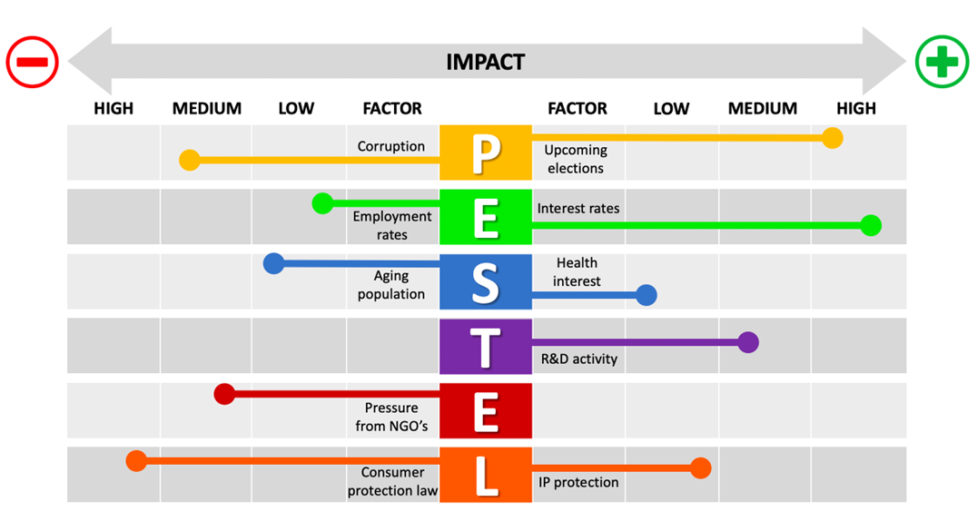
Several frameworks and tools can be used to avoid these kinds of blind spots by looking at a business and the forces that surround it across a range of different categories. Methodologies, including Porter’s five forces, PEST, VRIO, and the MECE principle, focus on a discrete set of categories through which to view the problem domain, each one of which has its strengths and weaknesses. For the sustainability challenge, a PEST / PESTLE / STEEPLE analysis would have likely given NetApp the perspective it needed to challenge long-held assumptions or to map the impact of disruptive change across environmental, political, and regulatory groupings. as a level of impact as shown in the following example from PESTEL Analysis PowerPoint - B2U - Business-to-you.com
There is nothing intrinsically necessary or authoritative about those categories. The PESTEL framework evolved from a simpler breakdown called PEST and has since evolved to STEEPLE or TELOS category sets, all of which are valid and all of which are arguable. Categories evolve, and each set needs to be fit for purpose.
There isn’t any “right” way to categorise the issues in a particular problem domain, and having multiple ways of categorising them is probably to look at the problem from different perspectives is perhaps better than agonising trying to find the one irrefutable truth. The “Truth” is often interconnected in strange ways, more like the messy hidden rhizome beneath a mushroom than a neat branching of trees of knowledge and trying to impose order on it can sometimes lead to analysis paralysis if not outright madness.

What do we look for?
With the right kind of categorisation, we can now ask the right questions. What types of things within these categories will likely impact us and our stakeholders? Let’s call them “watchlist items”. In the PESTEL diagram above, we see not only the categories but also one or more specific areas of interest inside each category, along with a rough measure of the impact that will have. Using the example of sustainability as a buying criterion, we might have identified the following.
-
Political
-
Sanctions against Russia
-
Retaliatory Sanctions vs the West
-
European Energy Disruption and Rationing
-
Escalation of Hybrid warfare
-
-
Economic
-
Energy Price Increases for those formerly dependent on Russian fossil fuel
-
Closer ties between Russia and the developing world (BRICS)
-
-
Technical
-
Shutdown of German Nuclear Power
-
Nation-state level cyber-warfare on information infrastructure
-
Greater focus on measurement and reporting of energy use
-
-
Ethical
- Acceleration of transition away from Fossil Fuels
This is by no means an exhaustive list, and much of it has the benefit of hindsight, but two findings should be clear from that list.
The first finding is that heightened concerns over energy infrastructure and cybersecurity could have been identified as early as February 2021. The second finding is that some of the identified watchlist items could belong to multiple categories. For example, is the shutdown of nuclear power a technical, economic, or ethical issue? It could easily be argued that it belongs in all three and that the connections between the categories and the watchlist items aren’t the superficial kind of hierarchical taxonomy that we have come to depend on to structure our knowledge since the 19th century.
Suppose we want to avoid descending into fruitless arguments about which category a watchlist item belongs in. In that case, our analysis tool needs to provide a way for these to live in a kind of quantum superposition by simultaneously existing in many different categories.
In some cases, categorisation and watchlist creation may uncover new items of interest that don’t fit our chosen categories. This is a perfectly acceptable outcome because it allows us to start at the top with categories and work our way down to watchlist items, or conversely, start with things we are interested in and see what categories evolve from that and how well we have distributed our current thinking across all areas of concern.
This should alert us to areas of under or over-investment and potential blind spots.
Measuring Impact
Along with identifying the categories you use to derive insight and to help identify watchlist items within those categories, we need some way of determining the relative importance or impact each one of these items will have. The PESTEL diagram above uses a straightforward low, medium, and high impact, which is the least granular scale you can use effectively. At the other end of the scale are percentages or absolute revenue measures to the nearest cent, but these measures often hide the bigger truth.
Though I’m often in awe of our business planners when we announce our earnings and our revenue projections, for many of the things we are trying to predict, we don’t have the backing data or the experience needed to predict things with that level of confidence. The future can’t be predicted to the last decimal place, and we risk only analysing what can be measured, which leads to a kind of McNamara fallacy. If you’ve never heard of it, perhaps this quote will give you an idea of how dangerous it can be
“The first step is to measure whatever can be easily measured. The second step is to disregard that which can’t easily be measured or given a quantitative value. The third step is to presume that what can’t be easily measured isn’t essential. The fourth step is to say that what can’t be easily measured really doesn’t exist. This is suicide. “
Daniel Yankelovich, “Interpreting the New Life Styles”, Sales Management (1971)[2]
The other problem is that when granular metrics are available, it is often difficult for people without subject matter expertise to give those metrics adequate context. For example, if I say an email campaign resulted in a 0.3% open rate, can a non-marketing person tell me if that’s good or bad? Or if an analyst says that a given market has sales growth of 13%, can you say if that’s high or low growth without knowing how big or mature that market is?
In many cases, we are dealing with systems with many “unknown unknowns,” and assigning specific growth rates, percentages, total addressable market sizes, or penetration figures creates a false sense of accuracy.
To resolve this, we need to look at analyst methods like the Gartner Hype Cycle, Wardley Maps, and Technology Diffusion curves, where we see repeatedly five-stage or five-scale systems appear. In some cases, it’s possible to map differently named stages directly against each other. For example, the Slope of Enlightenment and the early majority are both stage 4 on each of these fixed adoption curve analyses.
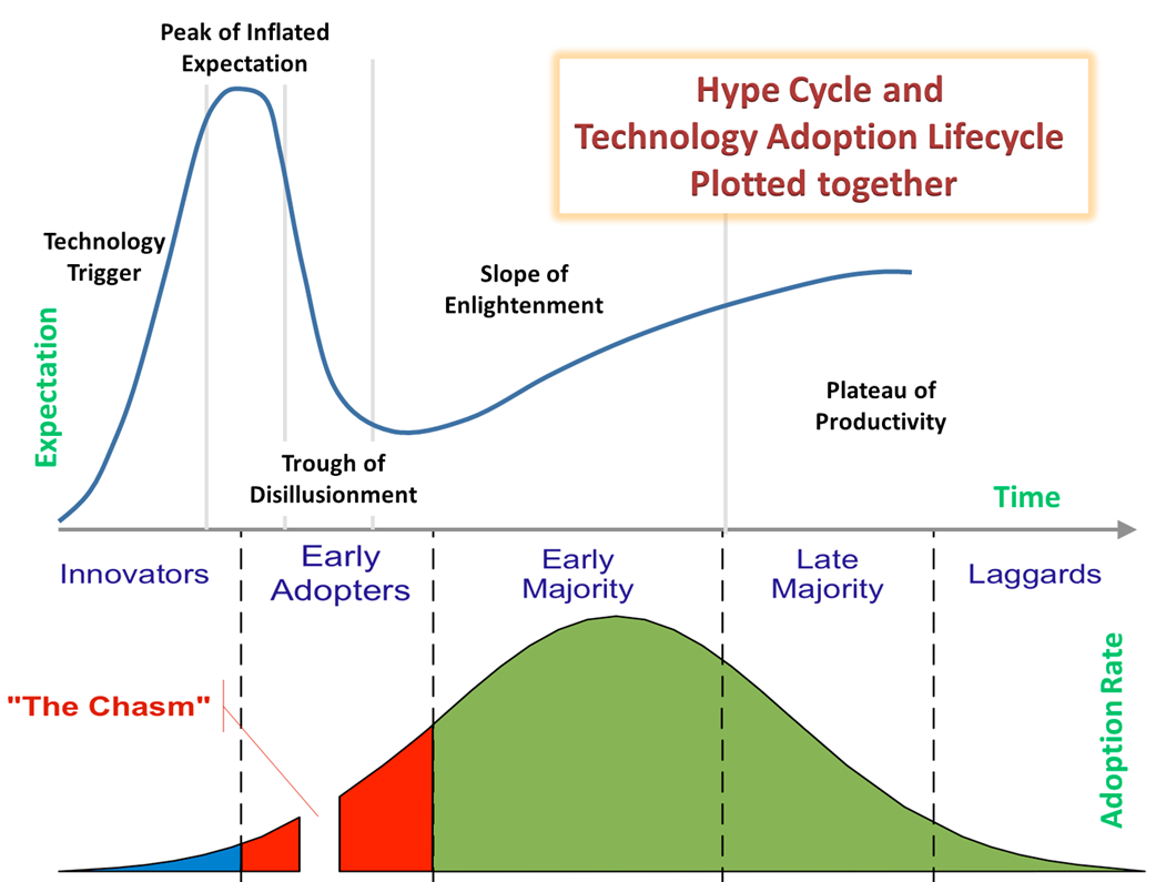
This five-point scale gives us some good opportunities to harmonise and validly compare data from various kinds of analysis. It also provides an intuitive and easily understood way of creating quality from a set of quantity ranges or a quantifiable metric from a purely qualitative estimate.
| 1 | 2 | 3 | 4 | 5 | |
|---|---|---|---|---|---|
| T-Shirt | XS | S | M | L | XL |
| Timescale | Immanent | Soon | Intermediate | Later | Much Later |
| Qantity | Very small | Small | Medium | Large | Very Large |
| Gartner Priority Matrix | Low | Low | Moderate | High | Transformational |
| Gartner Hype Cycle Stage | Tech Trigger | Peak of Inflated Expectations | Trough of Disillusionment | Slope of enlightenment | Plateau of Productivity |
| Gartner Time to Plateau | Time to Plateau < 2 Years | Time to Plateau 2 - 5 Years | Time to Plateau 5 - 10 Years | Time to Plateau >10 Years | Obsolete before plateau |
| Market growth | 1% or less | 1 - 5% | 6% - 10% | 10 - 20% | 20% or more |
| Analyst Ratings | Strong Sell | Sell | Hold | Buy | Strong Buy |
| Innovation Diffusion | Innovators | Early Adopters (Pre Chasm) | Early Adopters (Post Chasm) | Late Majority | Laggards |
| Performance Tier | No guarantee | Value | Standard | Performance | Ultra |
| Availability | two nines | three nines | four nines | five nines | six nines |
| Wardley Stages | Genesis | Custom Built | Custom Built (2) | Product / Rental | Commodity + Utility |
| Clickthrough Rates | <0.5% | 0.5-2% | 2% - 5% | 5%-10% | 10%+ |
Given the uncertain nature of the data, using a qualitative metric like this keeps us mindful of its speculative nature. At the same time, explicitly recording our assumptions about what “high” or “transformative” means in our narratives keeps us honest and transparent in using qualitative terms between ourselves and in our marketing and other narratives.
Measuring Time
The final element in this is the question of time and what actions we should be taking now to prepare for the things we have identified as being essential to us. This is the most crucial question of all and the most challenging question to answer. Almost anyone can see that the stock market, along with sporadic booms and busts, will go up over time. If you’re patient, you can make good progress, but if you knew precisely what days it would be up or down with exact certainty, you could become the wealthiest person in the world. Being too early into the market is often as bad as being too late. Trying to predict precisely when a given trend will have a specific impact requires a level of information and predictability that most futurists don’t have. As mentioned earlier, our financial team’s ability to predict NetApp’s financial metrics three months to a year out seems nearly magic. However, even that still doesn’t answer the most critical question.
What should I be doing about this future impact today?
One of the best ways of answering this comes from McKinsey via their “Three Horizons” model.
This framework isn’t new; indeed, the best explanation can be found in an article entitled Enduring Ideas: The three horizons of growth | McKinsey. It assumes that adoption follows a series of “S-curves,” which maps well to the technology adoption model.
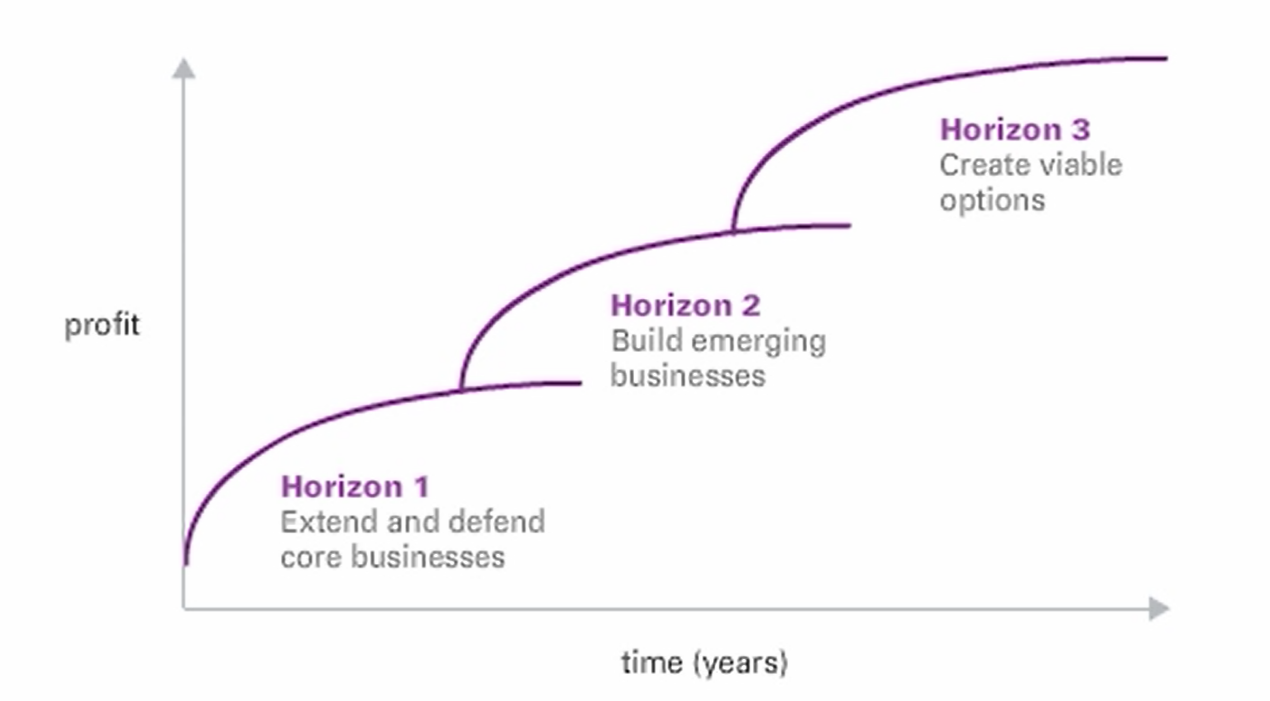
It also maps well to Gartner’s Transform, Grow, Run model. The things in Horizon One are well known or are dominated by “known knowns”; the business depends on their existence, and the focus is to run them at scale with the greatest efficiency. On a Wardley map, this corresponds to the utility stage of development. This is the realm of superior execution and management excellence. At the other end of the scale is Horizon 3, where things are the least well-known, with “unknown unknowns”, and the risks of guessing wrong are high, along with the rewards from making the right moves early. This is the place where vision, enthusiasm, and evangelism thrive. It is also where leadership has the most significant transformational impact.
In the middle is horizon 2, which takes the successful efforts of the high-risk horizon three efforts and confers positional advantage. I characterise this as the “known unknowns” stage. This is where aggressive entrepreneurship, growth mindsets, and flexible budgets rule.
As noted in the article
“Time, as noted on the x-axis, should not be interpreted as a prompt for when to pay attention—now, later, or much later. Companies must manage businesses along all three horizons concurrently.”
Rather than trying to guess exactly when a watchlist item will create an impact, using the three horizons model focuses on what level of investment is warranted and what kind of management and leadership approach is needed to address that item today to prepare ourselves for what may happen in the future.
Bringing it all together – The Magic Roundabout™ schematic”
Now that we have all of these requirements clarified, how can we create a tool that effectively and visually pleasingly communicates all of these with the data we already have or can be gathered easily using commonly available tools with minimal need for enablement?
The answer is “The Magic Roundabout™ schematic”. This combines categories, watchlist items, impact scores, and McKinsey Horizons into a “Sunburst” diagram available to every user of the Microsoft Office suite of products. The underlying dataset is an elementary Excel spreadsheet table that looks like this.
| Category | Horizon 1 | Horizon 2 | Horizon 3 | Importance |
|---|---|---|---|---|
| AI | . | . | AI based Inside-sales | 3 |
| AI | . | Content Creation | 3 | |
| AI | Website Chatbots | 3 | ||
| Cloud | . | . | Serverless + PaaS | 4 |
| Cloud | . | Containerisation | 3 | |
| Cloud | Lift & Shift | 3 | ||
| CyberSecurity | . | . | Exfiltration detection and prevention | 3 |
| CyberSecurity | . | Immutable Snapshots + Logical Airgap | 3 | |
| CyberSecurity | Traditional Backup | 3 | ||
| Sustainability | . | . | Dynamic Rebalancing to Cloud | 3 |
| Sustainability | . | Sustainability Reporting | 3 | |
| Sustainability | HDD to Flash | 3 | ||
| Flash | . | . | PLC | 3 |
| Flash | . | QLC | 3 | |
| Flash | High performance flash | 3 |
Which results in a diagram that looks like this
However, a more complex example shows how this can be extended or adapted to accommodate some of the requirements that were brought up earlier, including the need for a watchlist item to belong to multiple categories. It also provides for things not previously addressed, such as tracking technology that is currently on horizon one but evolving rapidly due to changes and technical disruptions.
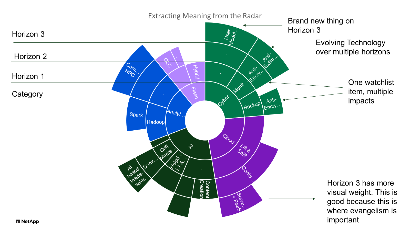
While the radial nature of the sunburst diagram clearly shows the trend and horizons and, based on early prototyping, is the most visually appealing way of representing our data, like a Mercator projection, it does tend to distort the relative importance of watchlist items towards the edges of the map. This can be addressed by using the complementary treemap diagram, which uses exactly the same dataset.
This is clearer to read and preserves the relative overall importance at the expense of navigating the trends over time.